MyCourses Redesign

About MyCourses
MyCourses is a learning management system (LMS) designed to help students and instructors manage course materials, assignments, grades, and communication in one central platform. It serves as a hub for
accessing lecture content,
submitting assignments,
tracking progress, and staying updated with course-related information.

why it needed a refresh
I found myself digging through endless folders on MyCourses—RIT’s Learning Management System—trying to find a single PowerPoint slide. Was it under “Course Content?” Maybe “Assignments?” Or was it hidden inside some module? Frustration built up as I realized I wasn’t the only one struggling. My classmates had the same complaints:
“Why does it take forever to find the one file I need?”
“Assignments and submission links are scattered everywhere.”
“The UI is outdated and not intuitive at all.”
It was clear—the system needed change.
learning from user insights
I created a survey on Google Forms with 10 questions (6 objective and 4 subjective) that collected students' opinions and thoughts on the current platform. After analyzing that data, I created a persona and identified key insights.


key friction points in the current platform
After analyzing students' insights and my evaluation of the platform, two common problems stood out that were relevant to - assignments, content, grades, and other important information. Those were the following,

CONTENT OVERLOAD
The homepage fails to guide users toward what’s essential. Instead of immediately showing the courses they’re enrolled in or tasks they need to complete, users are overwhelmed by secondary content that distracts from their primary needs. This lack of clear focus makes it difficult to identify what to do first, leading to frustration and wasted time navigating through irrelevant information.
HIDDEN INFORMATION & EXTRA STEPS
The course overview page fails to provide users with essential details upfront, forcing them to rely on the header navigation to locate specific content. This adds unnecessary steps to their workflow, making it harder to find materials quickly. Additionally, the page does not highlight newly added content, leaving users unaware of updates and requiring them to manually search through multiple sections.

Reducing complexity in user flows
I examined the assignment submission flow and noticed that users took 6 steps to reach the file drop box window. This seemed unnecessary and frustrating especially when 92% of users indicated assignment submission as their primary use case. I iterated on flows and reduced the number of steps from 6 to 1.

first redesign attempt
After creating simplified user flows, I started designing the new interface with the intent to create a modern, fresh, and intuitive experience.

What went wrong?
- Does not highlight assignments.
- Overloads the user with content and assignments competing for attention.
- UI seems outdated and old
solution 1:
super quick access to content
before
Finding course content is time-consuming and frustrating because materials are scattered across different sections of the platform. Professors upload resources inconsistently—sometimes in the assignments section, other times under course content—creating confusion. Students often waste time searching for specific lecture materials, like PowerPoint slides, because there is no clear organizational structure or search functionality to streamline access.
Users find it difficult to remember and find a file that contains a particular subject/topic. They spend additional time going through all folders and files to find the content inside it.

Problems
- Unclear feedback of system status.
- Files hidden inside folders with minimal information of its contents.
After
A content-only page with appealing thumbnails for easy identification and recognition.
A ‘most-viewed this week’ section to view what most students are reading at present to stay aligned with the class.
Quick filtering of content by time, topics, and file type.
Each resource is associated with a ‘topic’ which is a summary of all content available inside it. Users can easily filter through piles of resources when looking for a particular topic.


solution 2:
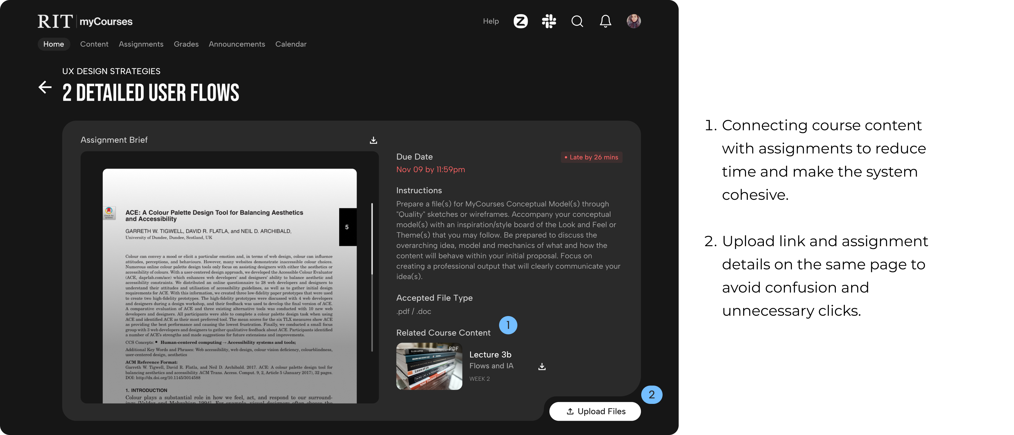
One click assignment submission
before
The assignment brief and the submission sections are separate, leading to accidental clicks and confusion. Students struggle to locate the upload section, understand file type requirements, and find assignment details, as they are uploaded in inconsistent places depending on the professor.

Problems
- Visual hierarchy given to assignments is low, making it easily overlooked.
- How to submit? When is it due? What course is it under?
After
Assignment cards present under each course clearly highlighting the due date and important instructions. One click upload option for immediate submissions and a playful interaction to view upcoming assignments. Users can also access assignment brief by clicking on the card.


new features

visual style

MODERN UI
- Curved edges.
- Monochromatic color palette to highlight content.
- Dark mode for night-time studies

BOLD TYPOGRAPHY
Enhances the visual appeal of designs, makes it appear modern, confident, and impactful while maintaining clarity and purpose.

MICROINTERACTIONS
To reduce stress and foster a more engaging and relatable connection with the platform.
how successful was the design?
The goal of the redesign was not just better aesthetics, but better functionality and usability. Here's what the new design did better.
55% drop in time taken to upload assignments.
85% drop in time taken to find a course content.
8 seconds on average to find professor information as compared to 90 seconds.
Final Thoughts
The UI of myCourses was enhanced with a cleaner, more intuitive layout, improved visual hierarchy, and optimized navigation. Key UX pain points, such as confusing workflows and cluttered interfaces, were identified through user research and addressed with targeted redesigns. Features like playful micro-interactions, streamlined assignment tracking, and content filtering were introduced to create a more user-friendly and engaging platform for students.


.svg)
